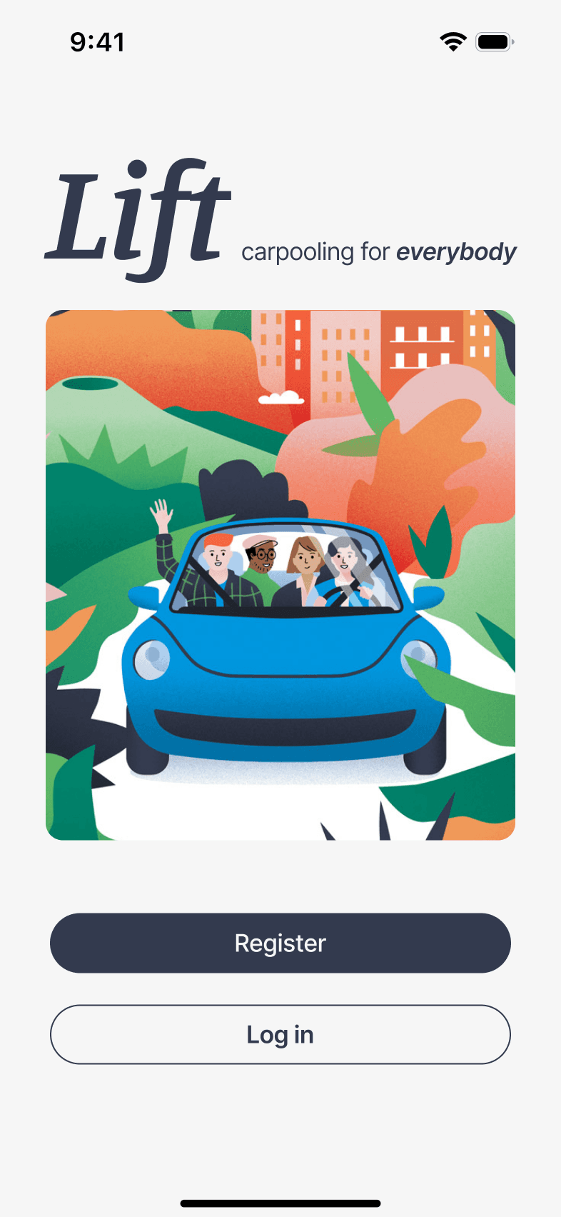
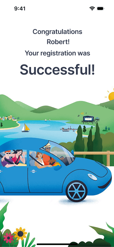
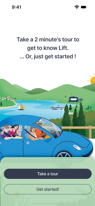
Step-by-step
Onboarding flow
People with disabilities are often overlooked in design. The task was to create a quick and intuitive onboarding flow for a carpooling app that is inclusive and accessible for all users.
Overview
Solution
The Process
In this fictive case, the assignment was about usability testing and users with disabilities. We created personas without user research, they are being made to be sure to design for a given user group, The task is about designing for users with disabilities and conduct a user test and do iterations on design based on feedback.
Resarch
Best practice
WCAG requirements
Defining
Create personas
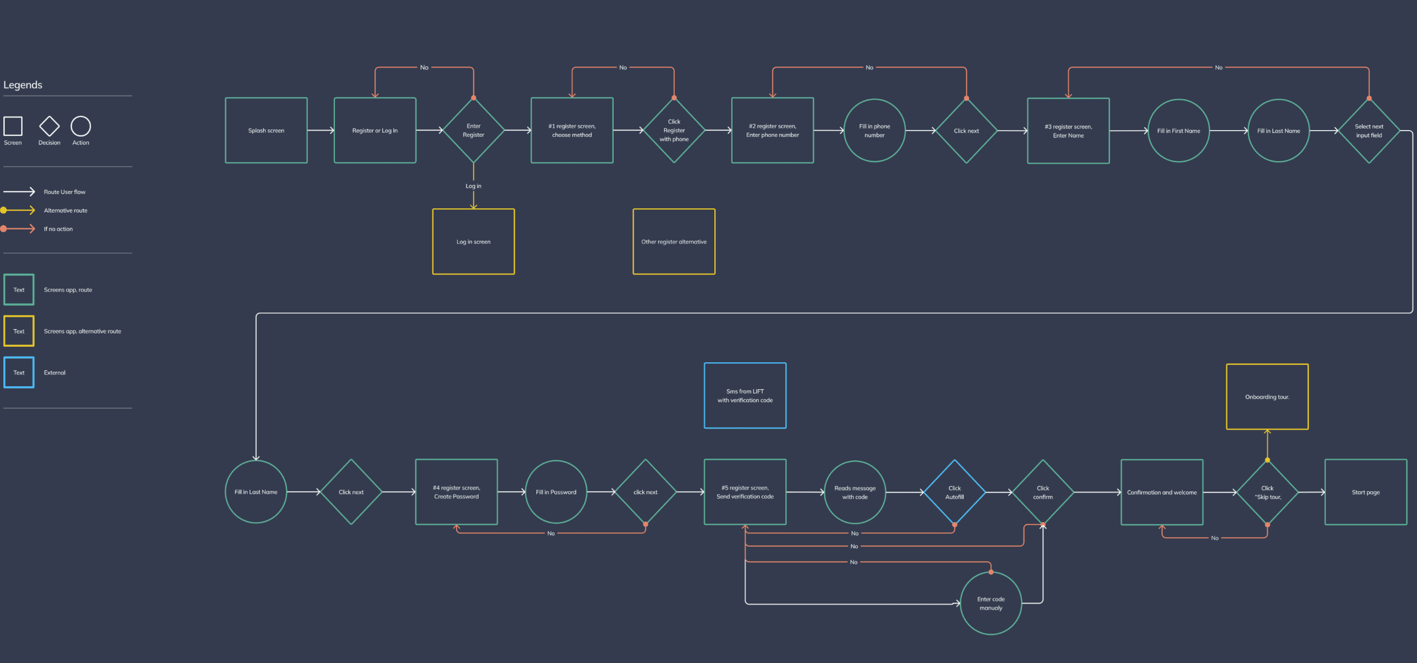
User flows
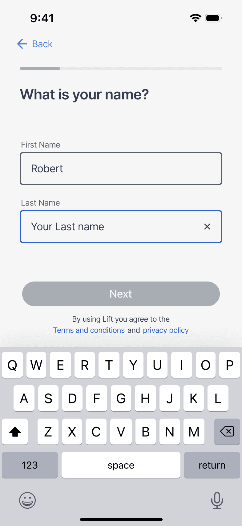
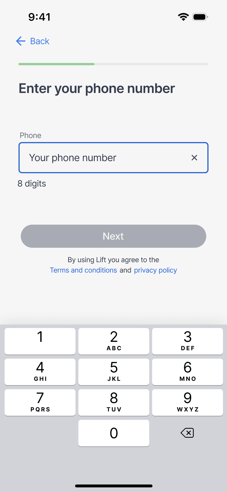
Prototyping
Lo-fi- mid-fi sketching
Hi-fi
Prototypes
Animation
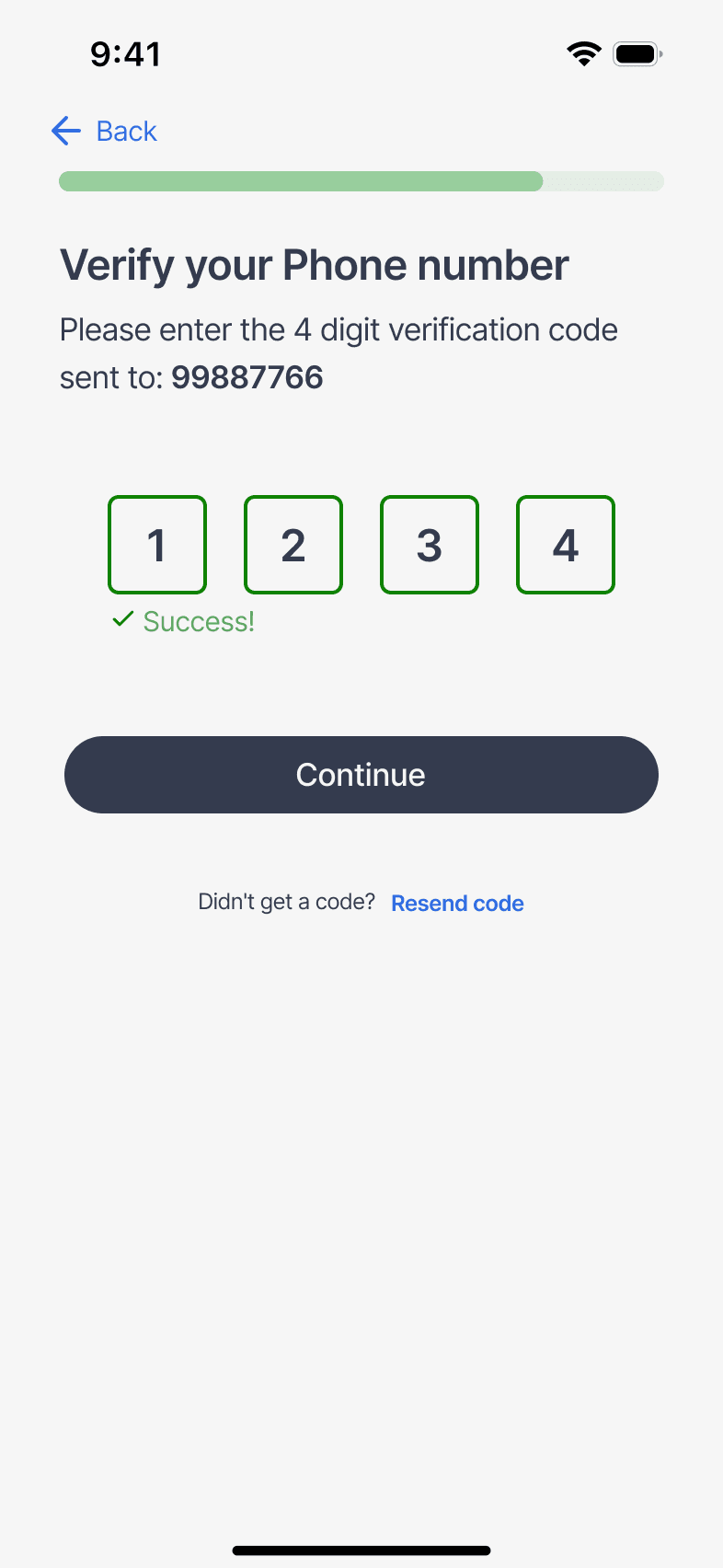
Testing
Moderated usability test
Semi scripted
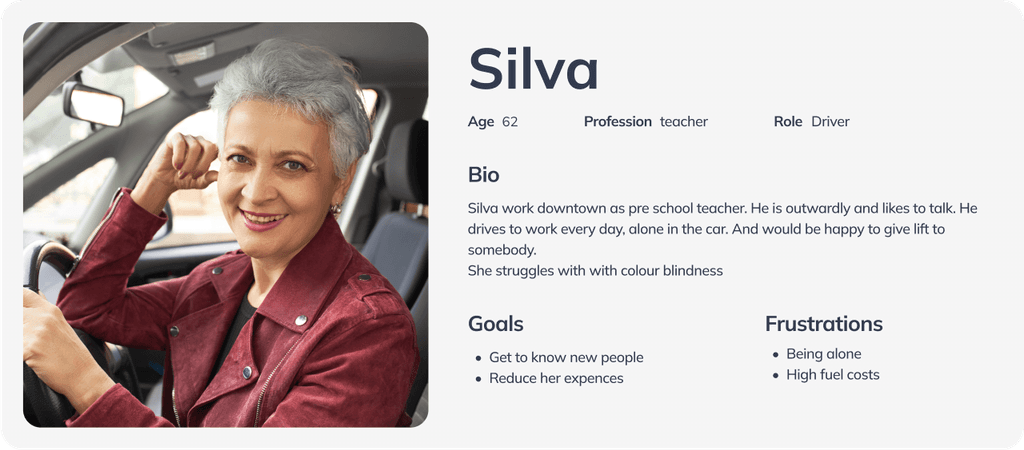
Personas
Two personas were made. Both personas has different disabilities, Primary persona has blurred vision and secondary is colour blind.
Primary persona

Secondary persona
User flow
Designing
Lo-fi to Hi-fi
By Lo and mid fi sketching the structure and ideas can be iterated on fast and effective without changing the component library, Many new ideas and issues is still easier to discover during hi-fi sketching.

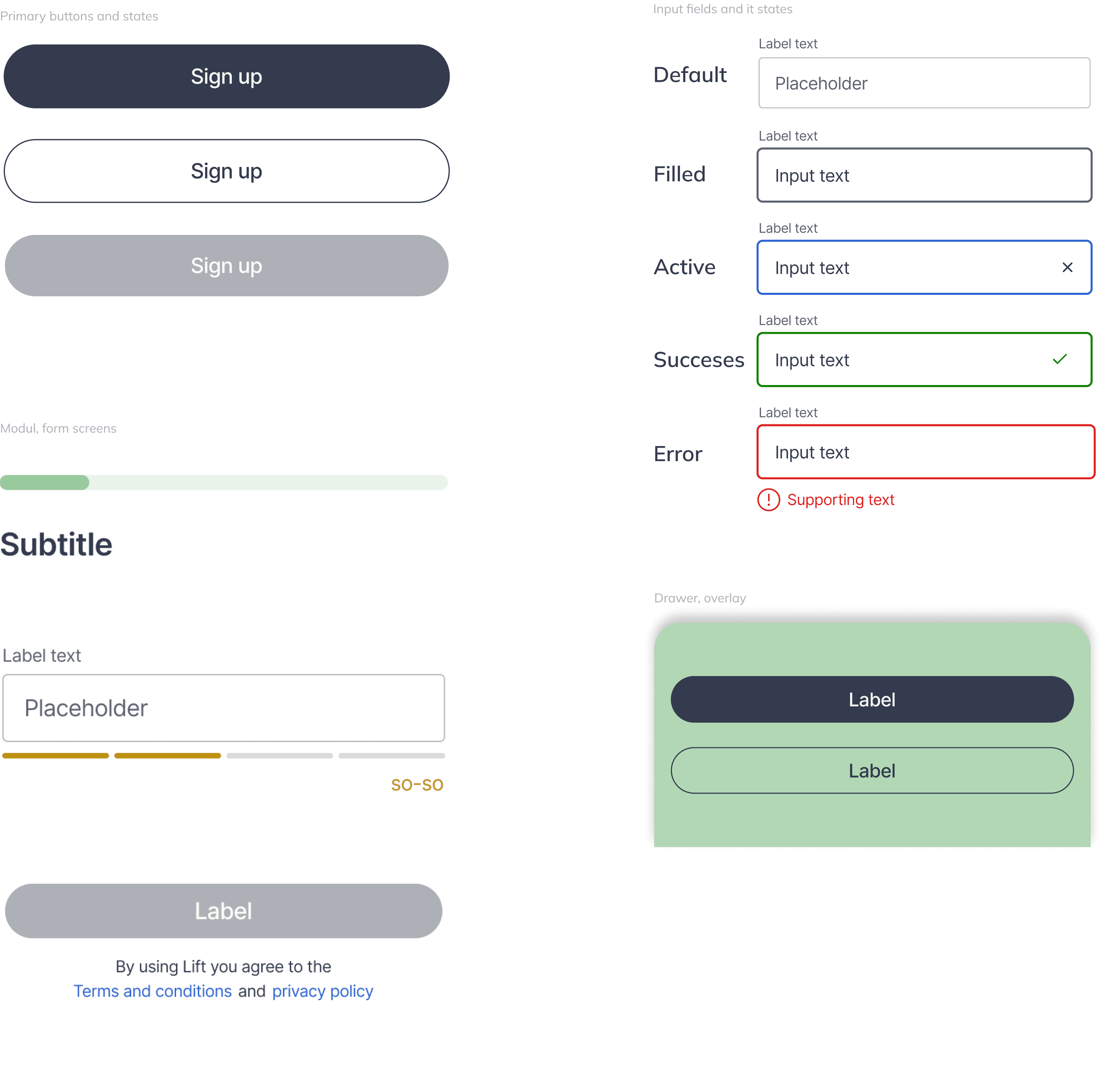
Design system / Component libary
A small expandable design system, Build up by Components, modules and tokens . Variations of buttons and forms with its states are only designed for whats in use in the signup flow by now.
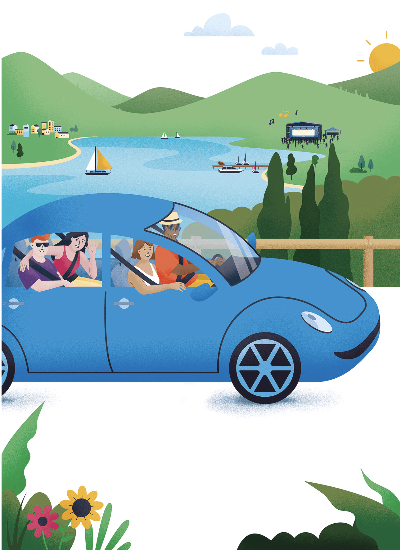
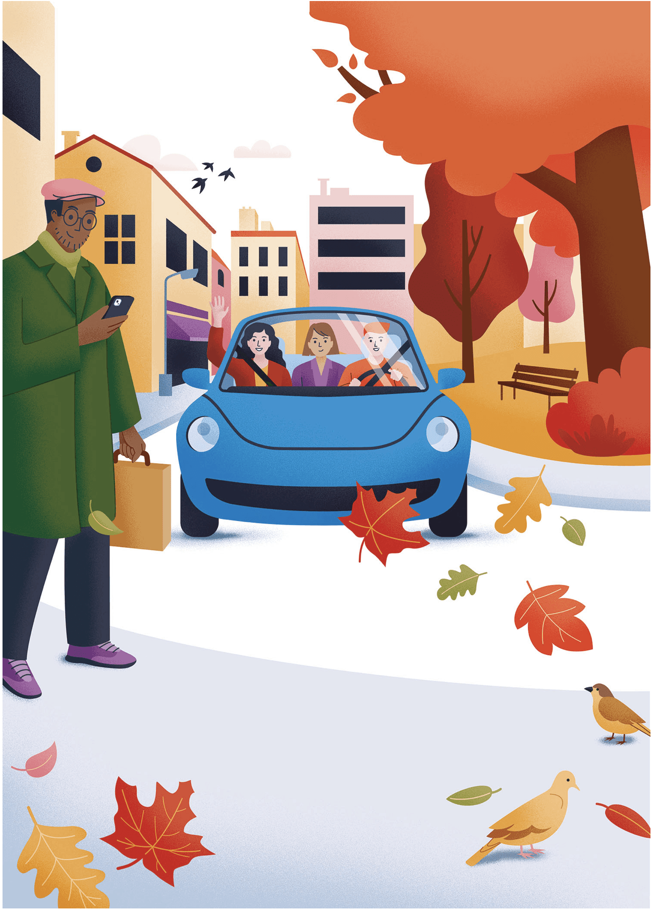
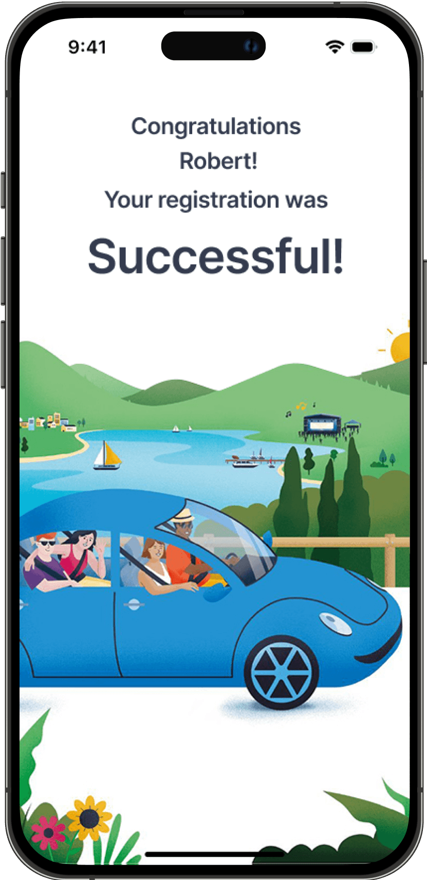
Illustrations
The Illustrations play a big role in what give the visual identity to the signup process, Users are introduced and get to know the products identity in an early phase.
With the permition to use these illustrations by Catherine Benini

Accessebility
All Colours used in the design has been checked and adjusted so they meets the WCAG 2 requirements.
Blurred vision (screens tested in UT)

Colour blind, Deuteranopia
Colour Contrasts meets WCAG 2 requirements

Testing the product
Testing how the product is received by the user with a blurred vision.
The participant were asked to open the app and test the product, without any other instructions to not lead him to regiser insted of log in. I wanted to test if Register was a term that felt naturally.
The participant navigates through the registration process without any big issues.
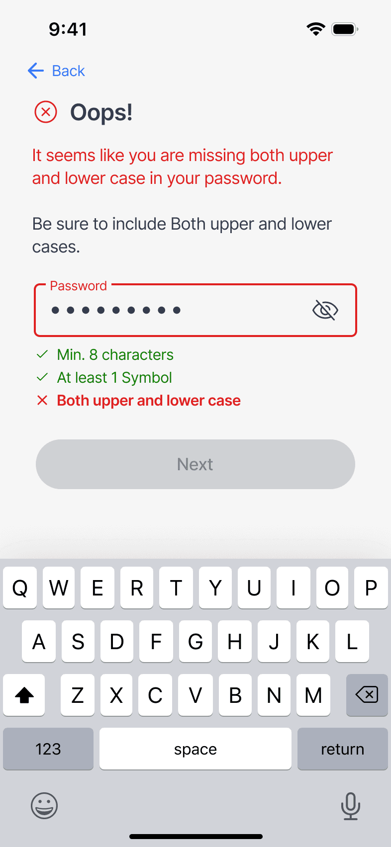
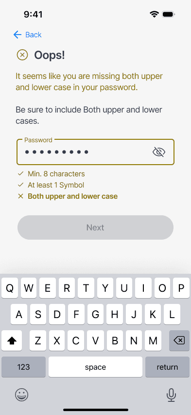
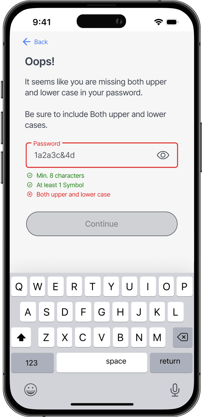
How ever the participant had problems reading some of the typing. You can read about that in the annotations.
Hard to tell the differenc between red and green in the supporting text
Very intuitive, works as expect it to.
Assuming the info text is the same on all pages, So I didn't get the info about what needed to be corrected.

Insights
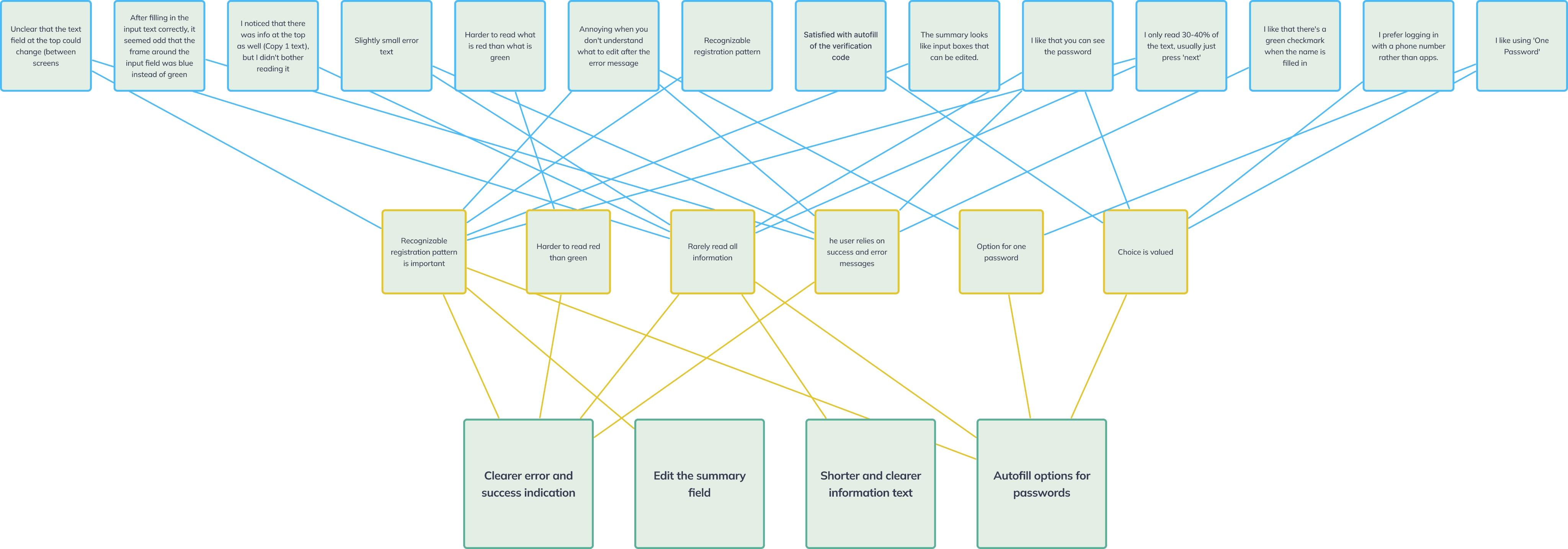
Feedback from usabilitytesting gave insights on elements to improve
By sythezizing data to get getting insights I came up with some conclutions for Improvement
Iterations after UT
Some feedback was given during usability testing, and iterations has been done.
The info text here is often overlooked by users, assuming its same text as previous page
Type is too small to read with blured vision
It is harder to see the red than the green text

Progress bar has been added
Removed info text in top, as to much information gives information overload
Helper text has been replaced with password strength, user can choose the safety level of their password.
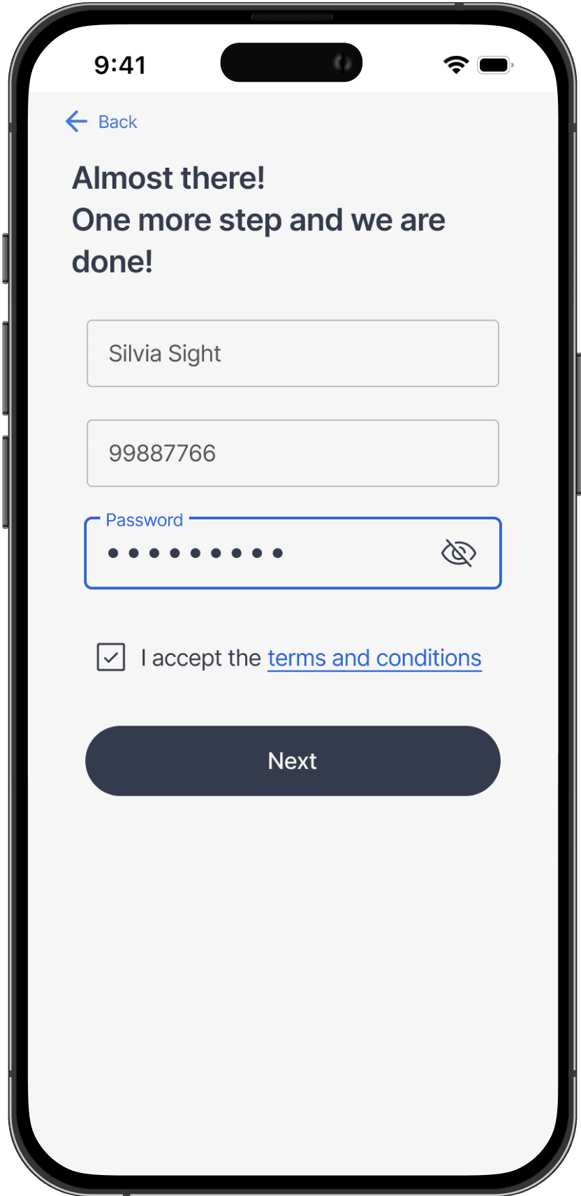
The participant found it confusing that the summary was in the input boxes. That gives the impression that they can be edited
The need for summary after only three input is not necessary. It also making the registration process less overwhelming.
Result
User testing on user with blurred vision gave me insights that a familiar patterns is important and text is easily overlooked.
The time frame for solving this assignment is also limited to one week and looking in to best practice and common ways and updated ways of using indication of password strength for instance, made me look at solutions that dont need same amount of text and provide only essential information.